Treemap Chart
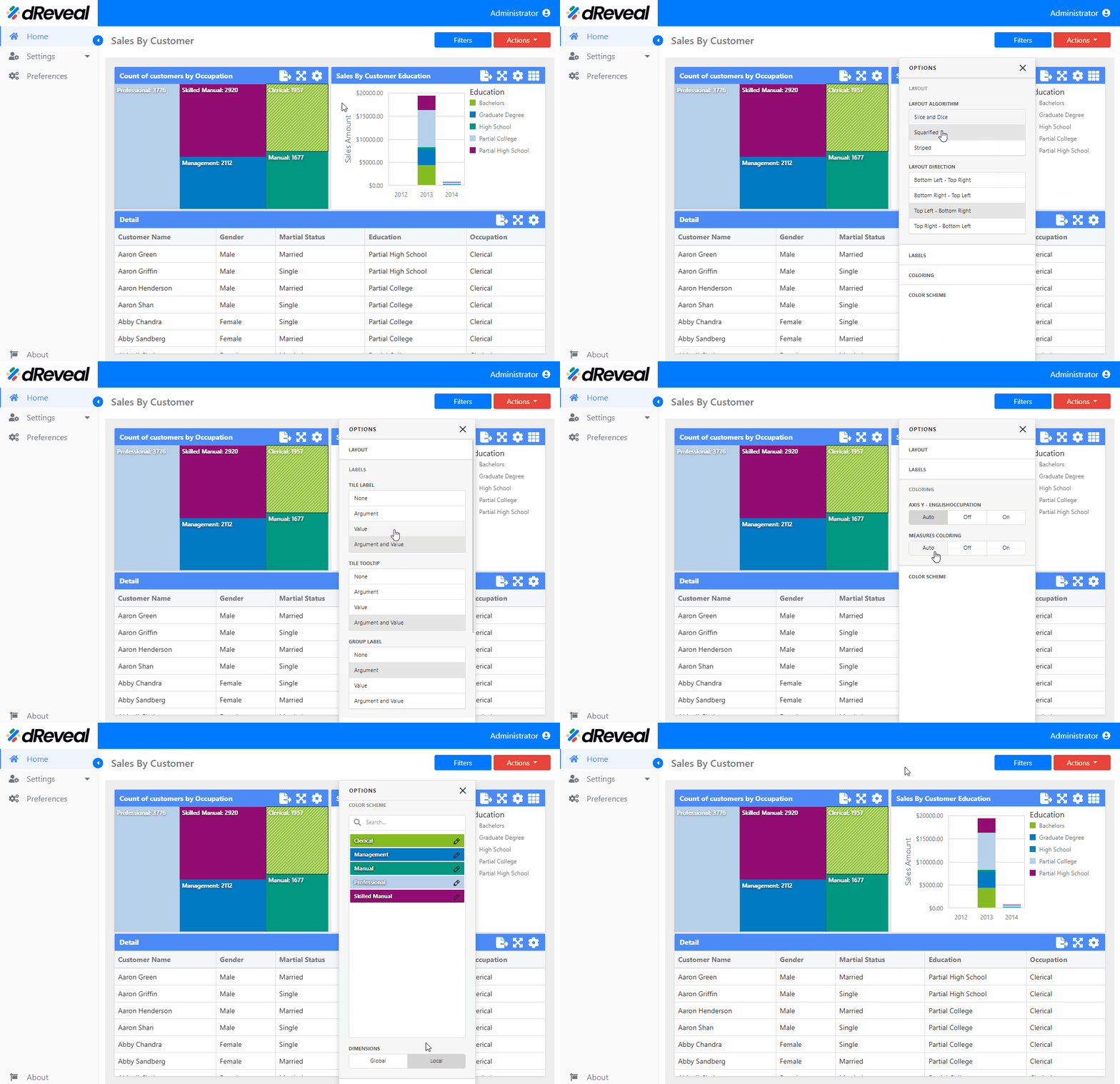
A Treemap chart is a hierarchical visualization that uses nested rectangles to represent data in a tree structure, where the size of each rectangle reflects a quantitative magnitude, and the color can show an additional dimension of the data. This type of chart is useful for showing how parts are distributed within a whole and how different categories or elements compare within a hierarchy. These charts offer a variety of options to customize several aspects of the Treemap chart to adjust its appearance and functionality according to your specific needs. These configurations can be found in the Menu option. The following sections will detail these options:
LAYOUT
The options vary depending on the type of chart. In the Treemap chart, the user has the following option in the "LAYOUT" section.
| Options | Values | Description |
|---|---|---|
| LAYOUT ALGORITHM | Select a value | This option allows the user to select the desired direction from the Layout Algorithm list. The available algorithms include: Slice and Dice - Divides space between items by slicing it in the specified direction based on item value. Squarified - Arranges tiles to achieve a width/height ratio closer to 1. Striped - A variation of the Squarified algorithm where tiles are arranged side by side in columns or rows. |
| LAYOUT DIRECTION | Select a value | This option allows the user to choose a layout direction to organize tiles based on their sizes. The Treemap arranges tiles in descending order from maximum to minimum values. To do this, select the desired direction from the Layout Direction list: Bottom Left - Top Right - Arranges tiles from the bottom-left to the top-right corner. Bottom Right - Top Left - Arranges tiles from the bottom-right to the top-left corner. Top Left - Bottom Right - Arranges tiles from the top-left to the bottom-right corner. Top Right - Bottom Left - Arranges tiles from the top-right to the bottom-left corner. |
LABELS
The options vary depending on the type of chart. In the Treemap chart, the user has the following option in the "LABELS" section.
| Options | Values | Description |
|---|---|---|
| TILE LABEL | Select a value | This option allows the user to define what information should be displayed in the tile label. |
| TILE TOOLTIP | Select a value | This option allows the user to define what information should be displayed in the tile tooltip. |
| GROUP LABEL | Select a value | This option allows the user to define what information should be displayed in the group label. |
| GROUP TOOLTIP | Select a value | This option allows the user to define what information should be displayed in the group tooltip. |
COLORING
The options vary depending on the type of chart. In the Treemap chart, the user has the following option in the "COLORING" section.
| Options | Values | Description |
|---|---|---|
| AXIS Y | Auto/Off/On | This option allows the user to define how colors will be applied to the segments of the Treemap Dashboard, the values associated with the first argument are distinguished by various hues. It contains three options: Auto - Automatically assigns different colors to each argument using a predefined palette. On - Activates coloring based on the arguments and allows additional customization configurations. Off - Deactivates coloring based on the arguments; all segments are represented with the same color. |
| MEASURES COLORING | Auto/Off/On | This option allows the user to define how colors will be applied in the Treemap Dashboard, values that correspond to different measures are colored by different hues. It contains three options: Auto - Automatically assigns different colors to each measure using a predefined palette. On - Activates measure-based coloring and allows additional customization configurations. Off - Deactivates measure-based coloring; all metrics will be represented with the same color. |
COLOR SCHEME
The options vary depending on the type of chart. In the Treemap chart, the user has the following option in the "COLOR SCHEME" section.
| Options | Values | Description |
|---|---|---|
| DIMENSIONS | Global/Local | This option provides the client with two choices for coloring dashboard item elements: Global - Applies consistent colors for identical values throughout the dashboard. Local - Utilizes a unique set of colors for each individual dashboard item. |
How to Apply the Settings of the 'Menu' Option
To apply the settings in a chart, first enter your username and password, then click the Login button. Once logged in, navigate to the report you want to run and double-click it to open. Next, click the Apply button to display the report. Once the report is loaded, click on the Menu option located at the top right of the chart; the icon is a gear. The available options for configuring the chart will then be displayed.
Treemap Chart

